Graphic designers aren't programmers and sometimes don't know how to properly prepare graphic assets for developers. This simple cheatsheet should help them to do their job better, and to simplify developers' lives.
| Qualifier | DPI | Scaling factor | Launcher icon | Action bar, tab icon | Notification icon (API 11) | Notification icon (API 9) | Notification icon (older) |
|---|---|---|---|---|---|---|---|
| ldpi | 120 | 0.75 | 36 x 36 32 x 32 |
24 x 24 18 x 18 |
18 x 18 16 x 16 |
12 x 19 12 x 12 |
19 x 19 16 x 16 |
| mdpi | 160 | 1.0 | 48 x 48 42 x 42 |
32 x 32 24 x 24 |
24 x 24 22 x 22 |
16 x 25 16 x 16 |
25 x 25 21 x 21 |
| hdpi | 240 | 1.5 | 72 x 72 64 x 64 |
48 x 48 36 x 36 |
36 x 36 33 x 33 |
24 x 38 24 x 24 |
38 x 38 32 x 32 |
| xhdpi | 320 | 2.0 | 96 x 96 84 x 84 |
64 x 64 48 x 48 |
48 x 48 44 x 44 |
32 x 50 32 x 32 |
50 x 50 42 x 42 |
| xxhdpi | 480 | 3.0 | 144 x 144 126 x 126 |
96 x 96 72 x 72 |
72 x 72 66 x 66 |
48 x 75 48 x 48 |
75 x 75 63 x 63 |
Notice: the first icon dimension in table cell is full asset size, the second icon dimension is optical square. Dimension values are in pixels.
Tip: creating ldpi assets is not really needed anymore. The devices are rare and the platform will just scale down mdpi.
Sources and useful links: Iconography, Supporting Multiple Screens, Icon Design Guidelines, Dimension
| Asset Type | Required | Image type | Dimension |
|---|---|---|---|
| Screenshot | yes | JPEG or 24-bit PNG (no alpha) |
min length for any side: 320 px max length for any side: 3840 px |
| High-res app icon | yes | 32-bit PNG (with alpha) |
512 x 512 px |
| Feature graphic | yes | JPEG or 24-bit PNG (no alpha) |
1024 x 500 px |
| Promotional graphic | no | JPEG or 24-bit PNG (no alpha) |
180 x 120 px |
| Video link | no | URL of YouTube video | - |
Sources and useful links: Graphic and Image Assets, Google Play Featured-Image Guidelines, Iconography
| Unit | Units / physical inch | Density independent | Same physical size on every screen |
|---|---|---|---|
| px | varies | no | no |
| in | 1 | yes | yes |
| mm | 25.4 | yes | yes |
| pt | 72 | yes | yes |
| dp | ~160 | yes | no |
| sp | ~160 | yes | no |
Sources and useful links: Understanding Density Independence in Android
| Type | Dimension |
|---|---|
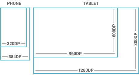
| Handset | smaller than 600 dp |
| Tablet | larger than or equal 600 dp |
Notice: one dp (density-independent pixel) is one pixel on a 160 DPI screen.
Sources and useful links: Metrics and Grids
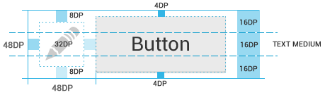
Touchable UI components are generally laid out along 48 dp units. Spacing between each UI element is 8 dp.

Sources and useful links: Metrics and Grids
| Qualifier | Dimension |
|---|---|
| Portrait | 48 dp |
| Landscape | 40 dp |
| Tablet | 56 dp |
Sources and useful links: Action Bar
| Type | Dimension |
|---|---|
| Micro | 12 sp |
| Small | 14 sp |
| Medium | 18 sp |
| Large | 22 sp |
Notice: one sp (scale-independent pixel) is one pixel on a 160 DPI screen if the user's global text scale is set to 100%.
Sources and useful links: Typography
A Nine-patch drawable is a stretchable bitmap image, which Android will automatically resize to accommodate the contents of the view in which you have placed it as the background, e.g. nine-patch background for button, which must stretch to accommodate strings of various lengths. The rules for nine-patch image are following:

Sources and useful links: Canvas and Drawables, Draw 9-patch, Simple Nine-patch Generator
Use color primarily for emphasis. Blue is the standard accent color in Android's color palette. Note that red and green may be indistinguishable to color-blind users. Primary colors are as follows:
Sources and useful links: Color
Android provides three system themes:
Sources and useful links: Themes, Holo Everywhere
File names must contain only lowercase a-z, 0-9, or _.
Drawables for the specific views (ListView, TextView, EditText, ProgressBar, CheckBox etc.) should be named like this views keeping the naming rules, e.g. drawable for CheckBox should be named "checkbox_on_bg.png".
| Asset Type | Prefix | Example |
|---|---|---|
| Action bar | ab_ |
ab_stacked.9.png |
| Button | btn_ |
btn_send_pressed.9.png |
| Dialog | dialog_ |
dialog_top.9.png |
| Divider | divider_ |
divider_horizontal.9.png |
| Icon | ic_ |
ic_star.png |
| Menu | menu_ |
menu_submenu_bg.9.png |
| Notification | notification_ |
notification_bg.9.png |
| Tabs | tab_ |
tab_pressed.9.png |
Sources and useful links: naming conventions taken from the Android SDK
| Asset Type | Prefix | Example |
|---|---|---|
| Icons | ic_ |
ic_star.png |
| Launcher icons | ic_launcher |
ic_launcher_calendar.png |
| Action bar icons | ic_menu |
ic_menu_archive.png |
| Status bar icons | ic_stat_notify |
ic_stat_notify_msg.png |
| Tab icons | ic_tab |
ic_tab_recent.png |
| Dialog icons | ic_dialog |
ic_dialog_info.png |
Sources and useful links: Icon Design Guidelines
| State | Suffix | Example |
|---|---|---|
| Normal | _normal |
btn_order_normal.9.png |
| Pressed | _pressed |
btn_order_pressed.9.png |
| Focused | _focused |
btn_order_focused.9.png |
| Disabled | _disabled |
btn_order_disabled.9.png |
| Selected | _selected |
btn_order_selected.9.png |
Sources and useful links: Touch Feedback
One drawable must have the same file name for all screen densities (ldpi, mdpi, hdpi etc.) and all these files must be organized according to density into the following directories. Here's the resources directory structure for drawables:
Android Icon Templates Pack v4.0
Source: Android Developers
Android Design 11/2013
Source: Android Developers
Android UI Design Kit PSD 4.4
Source: Taylor Ling on Android UI & UX
Android Developer Icons – Photoshop Shapes
Source: Spiderfly Apps
Copyright © 2013 Petr Nohejl, www.petrnohejl.cz
Document was last modified .
Found some mistake? Something is missing? Let me know or send pull request.
Thanks to
Peter Kahoun for KUCSS
and Google Android for great documentation.
This work is licensed under a Creative Commons Attribution-ShareAlike 3.0 Unported License.